Back to Portfolio Overview 项目概述
展厅屏显管理 · VR 内容调度 EXHIBIT DISPLAY MGMT · VR CONTENT SCHEDULING
某红色主题纪念馆 · 大屏内容投放管理系统 Memorial Museum

Display Content
Management System

展厅内容投放管理系统 · 屏显管理与 VR 管理
LARGE FORMAT CONTENT MANAGEMENT · DISPLAY & VR MODULES

展馆运营人员需要在无技术支持的情况下,自主管理多类展厅大屏的日常播放内容。这个系统的目标是把设备管理、内容调度、VR装载整合进一个操作门槛低、路径清晰的工具。

Museum staff needed to manage large-screen content across multiple exhibition halls without technical support. The system integrates device management, content scheduling, and VR loading into a single tool with a low operational barrier.

大屏内容投放管理系统主界面
角色 ROLE
主设计师
Lead Designer
职责 SCOPE
UX 架构、交互设计、视觉设计
UX architecture, interaction design, visual design
年份 YEAR
2024

为某红色主题纪念馆定制的展厅内容投放管理系统,支持主展厅屏、CAVE屏、引导交流屏、展示陈列屏、令牌触控屏等多类非标准硬件,以及独立的 VR 设备内容管理。设计目标是让无技术背景的馆内工作人员,能够独立完成日常的大屏内容排期与设备管理。

A custom content broadcast management system for a large-scale cultural venue, supporting five categories of non-standard display hardware, including primary screens, CAVE screens, wayfinding panels, exhibition array screens, and token touch screens, alongside a dedicated VR device management module. The goal was to enable non-technical museum staff to independently handle all daily content scheduling.

系统分为两个主模块:屏显管理和 VR 管理,对应展馆中两类完全不同的设备和内容形态。屏显管理下分设备和内容两个子入口,支持从设备侧和内容侧两个方向发起投放;VR 管理独立处理 VR 头显设备的内容装载与播放调度。

The system is divided into two main modules: Display Management and VR Management, reflecting the fundamentally different device types and content workflows in the venue. Display Management has dual entry points, while VR Management operates with an independent loading constraint for headset content.

内容投放管理系统 屏显系统 VR 系统 屏显管理 从设备出发 从内容出发 设备卡片列表 5类设备 · 类型筛选 单屏投放 多屏投放 投放完成 内容选择 素材库 / 表单 选设备(2步) 先类型 → 再具体 投放完成 VR 管理 管理对象 VR 设备 空闲 / 运行中 / 离线 VR 内容 .exe 程序包 VR 特有约束 装载机制 未装载 → 装载中 → 已装载 → 投放中 已装载状态下方可执行投放 投放操作 勾选设备 + 选内容 绑定关系确认后提交 投放完成(VR) Content Broadcast Management System Display System VR System Display Management Device-first Content-first Device card list 5 types · filtered by type Single screen Multi screen Broadcast done Content selection Asset library / Form Select device (2 steps) Type first → specific device Broadcast done VR Management Managed objects VR devices Idle / Running / Offline VR content .exe packages VR loading constraint Loading mechanism Unloaded → Loading → Loaded → Broadcasting Device must be loaded before broadcast Broadcast operation Select device + content Confirm binding, then submit Broadcast done (VR)
系统根节点 / 结果Root node / Result
主模块Main module
路径区域Flow region
功能节点Function node
VR 特有机制VR-specific constraint

系统结构与核心操作路径 - 两个主模块,屏显双入口 + VR 独立约束

System structure & core flows - two modules, dual entry points + VR loading constraint

01

两个投放起点,对应不同的用户心智

Two broadcast entry points, two user mental models

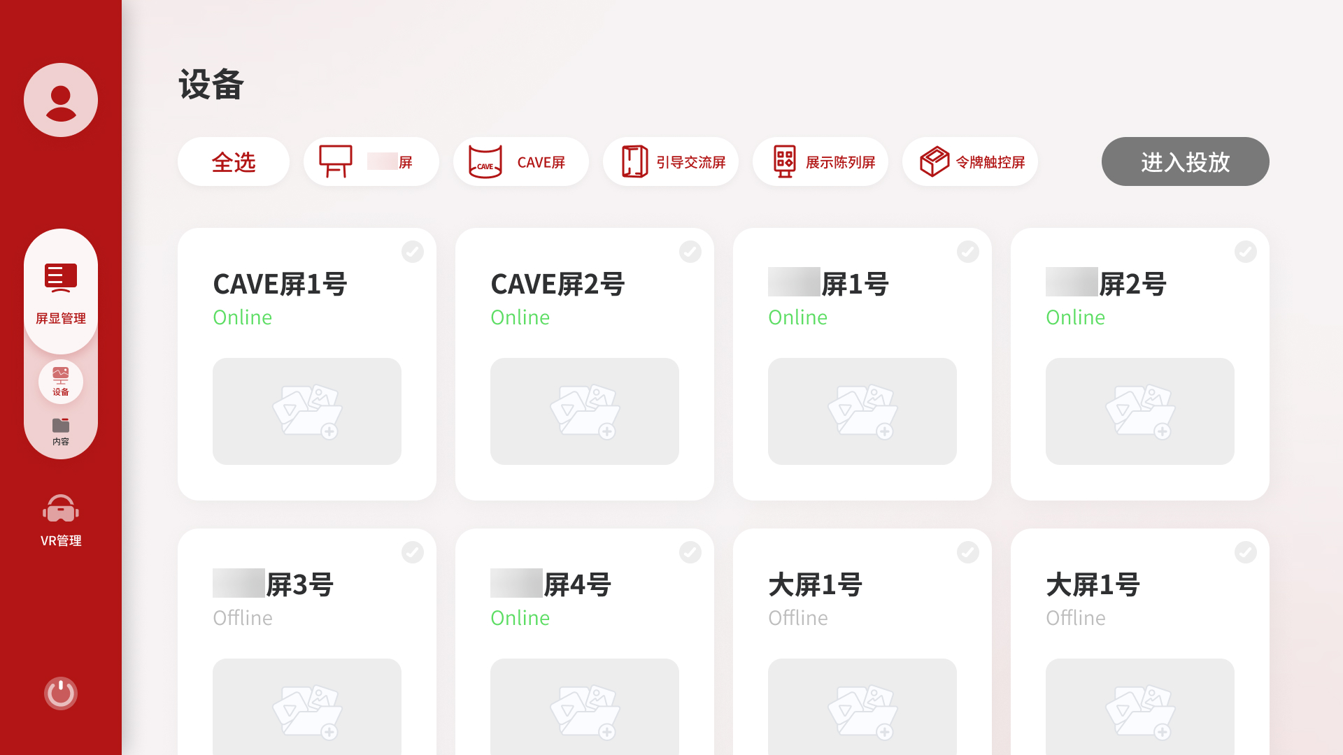
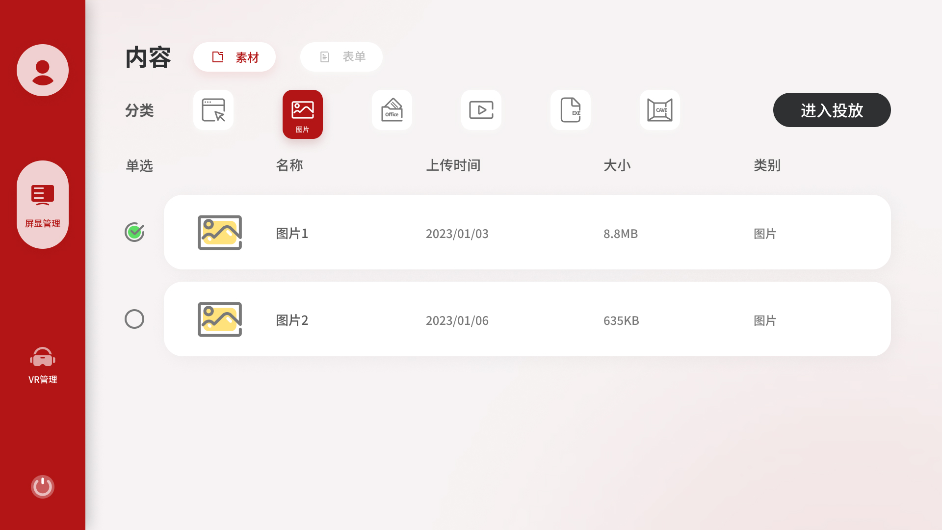
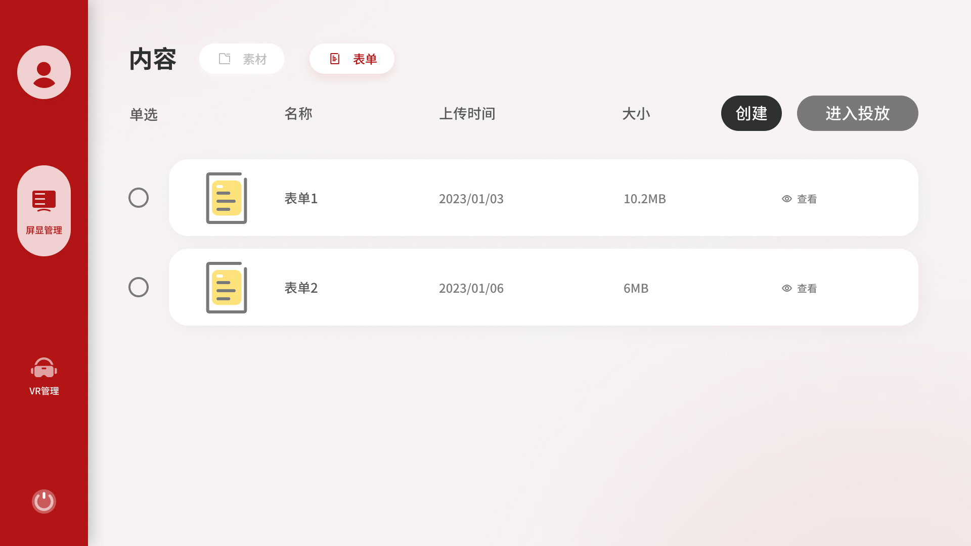
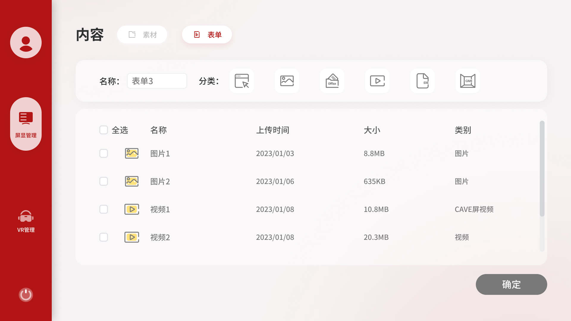
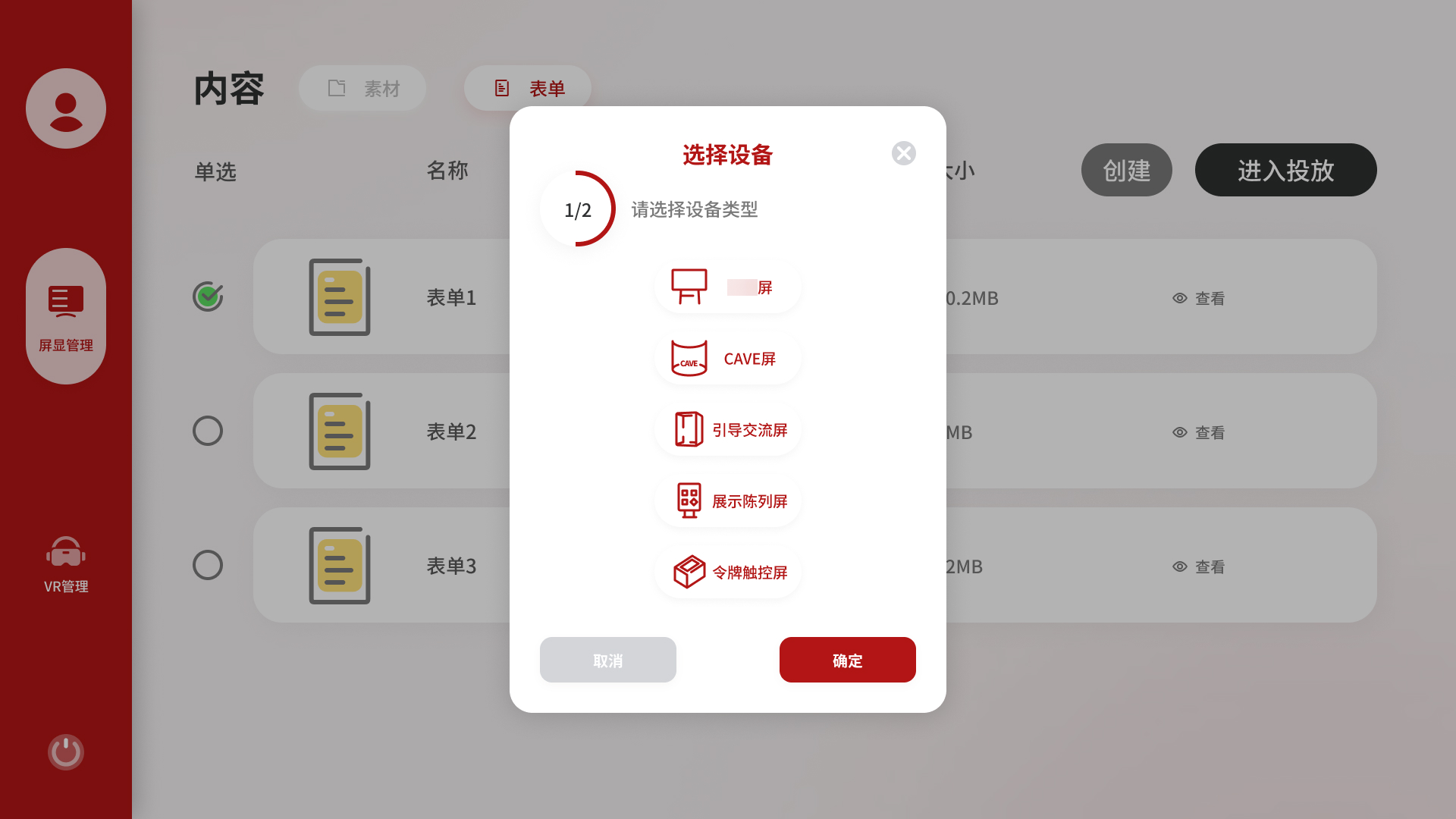
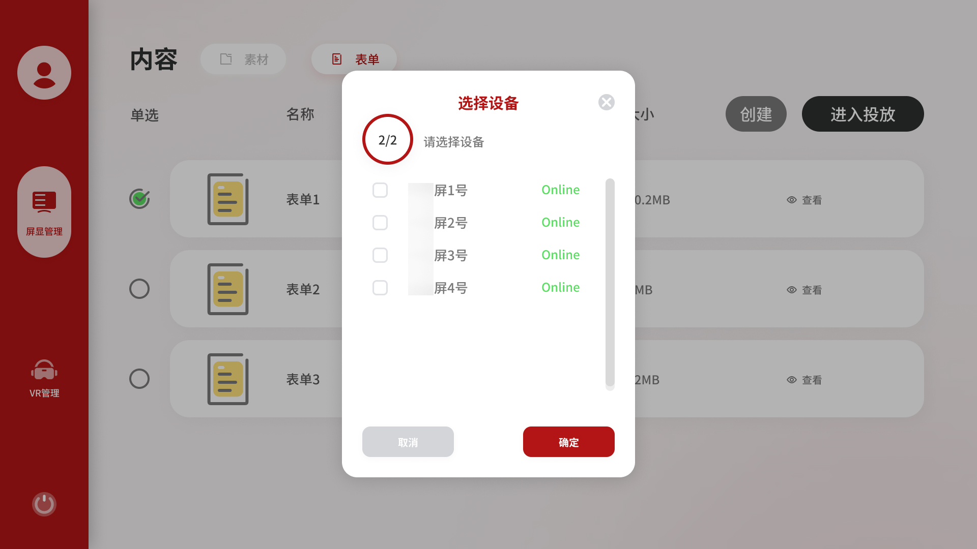
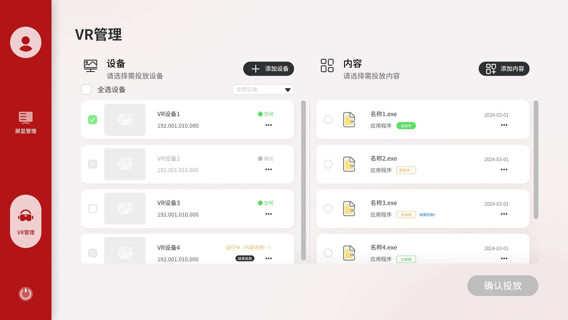
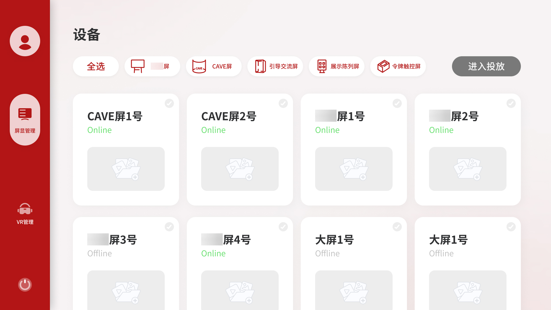
屏显管理提供了两个发起投放的入口:设备侧和内容侧。

从设备侧进入,用户先看到所有屏幕的状态,选定目标屏幕后再挑选内容,对应「我想给某台屏换个内容」的场景。从内容侧进入,用户先浏览素材库或表单列表,选好内容后再选择推到哪台设备,对应「我有一个素材想推出去」的场景。两个入口指向同样的投放结果,但操作路径的出发点不同,各自符合对应场景下用户的自然思维顺序。

Display Management provides two ways to start a broadcast: from the device side and from the content side.

Entering from the device side, the user sees all screens and their current status first, then picks content. This matches the scenario, "I want to change what's playing on this screen." Entering from the content side, the user browses the media library or playlist library first, then selects a target device. This matches, "I have something I want to push out." Both paths lead to the same outcome, but each follows the natural flow of its scenario.

屏显管理设备侧入口界面

设备侧入口 - 卡片视图,按设备类型筛选,直接进入投放

Device-side entry - card view with type filtering

屏显管理内容侧素材选择界面

内容侧入口 - 素材列表,单选后触发选择设备流程

Content-side entry - select media first, then choose a device

02

设备卡片视图:按类型组织,而不是按状态排列

Device card view: organized by type, not mixed

考虑到场馆可能涉及多类设备并存的情况,采用卡片网格加类型筛选 tab 的布局,让用户可以按设备类型快速过滤。

最终版改为卡片网格加类型筛选 tab,每张卡片展示设备名称、在线状态和当前投放内容缩略图。用户可以按类型快速过滤,只看主展厅屏或只看 CAVE屏。这个改动把「找到目标设备」的步骤从认知负担变成了视觉扫描。

Given that a venue of this type may involve multiple coexisting device categories, a card grid with type filter tabs was designed to let users narrow to the relevant device type quickly.

The final version uses a card grid with type filter tabs. Each card shows the device name, online status, and current content thumbnail. Filtering to a specific device type reduces the visible set to only what's relevant, shifting "finding the target device" from a cognitive task to a visual one.

设备卡片视图界面

设备卡片视图 - 按设备类型筛选,状态一眼可见

Device card view - type-filtered, status visible at a glance

03

表单:把播放清单做成可复用的内容类型

Playlists: reusable content packages

素材库里有图片、视频等文件类内容,但展馆运营中有一类需求是「固定搭配」,某个展区的大屏每天按顺序播放几个固定内容。如果每次都重新选一遍,操作重复且容易出错。

内容模块因此加入了「表单」,本质是一个可命名、可复用的播放清单。运营人员创建好表单后,每次投放只需选表单和目标设备两步完成。表单类内容还单独提供「查看」入口,因为不像图片可以直接预览,查看是确认内容正确的必要操作。

Beyond individual media files, museum operations often require fixed sequences. A particular gallery's screen may play the same set of content in the same order every morning. Selecting these items one by one each time is repetitive and error-prone.

The Content module therefore includes a Playlist feature, a named, reusable broadcast sequence. Staff create a playlist once, then deploy it to any compatible device in two steps. Playlists also have a dedicated Preview button, since unlike images they cannot be visually confirmed at a glance.

表单列表界面

表单列表 - 可复用的播放清单,支持查看和快速投放

Playlist list - reusable broadcast sequences with preview and quick broadcast

创建表单界面

创建表单 - 通过勾选内容快速组合播放清单

Create playlist - assemble a broadcast package by selecting content

04

选设备分两步:先类型,再具体设备

Two-step device selection: type first, then specific device

从内容侧发起投放时,选设备的弹窗分为两步:第一步选设备类型,第二步才选具体设备编号。

这个拆分是因为展馆设备数量多、类型差异大,一次平铺展示十余台设备,用户需要同时判断类型和编号。分层之后,第一步只需回答「我要投到哪类屏幕」,大幅降低误操作概率。右上角进度提示「1/2」「2/2」让用户清楚自己在流程的哪个位置。

When initiating a broadcast from the content side, selecting a device uses a two-step modal: step 1 selects the device type, step 2 selects the specific device within that type.

The split reduces cognitive load: in step one, the user only answers "what kind of screen", without simultaneously parsing device names and numbers. A progress indicator (1/2 → 2/2) keeps the user oriented in the flow.

选择设备类型界面

第一步 - 先选择设备类型,缩小判断范围

Step 1 - choose the device type first to reduce the decision space

选择具体设备界面

第二步 - 再选择具体设备编号并确认投放

Step 2 - then choose the exact device and confirm the broadcast

05

VR 管理:独立处理装载约束

VR Management: designing around a loading constraint

VR 内容是应用程序包,文件体积大,无法像视频一样实时推流,必须提前把文件装载到 VR 设备的本地存储才能播放。这个技术约束使 VR 管理和屏显管理的操作逻辑完全不同,因此独立为一个模块。

VR 管理采用左右双栏布局:左侧是 VR 设备列表,右侧是 VR 内容库。两栏并排是因为用户在操作前需要同时判断设备是否空闲、内容是否已装载,单栏或弹窗都无法同时呈现这两个信息。

内容侧有四种装载状态:未装载、装载中、已装载、投放中。未装载的内容旁边提供「立即装载」快捷入口,存储空间不足时弹出明确的报错提示。

VR content consists of application packages, large files that cannot stream in real time and must be loaded onto the VR device's local storage before playback. This technical constraint makes VR Management fundamentally different from Display Management, which is why it lives as a separate module.

VR Management uses a two-column layout, with devices on the left and content on the right. Side-by-side placement lets operators check both device availability and content load status simultaneously, while a modal or sequential flow would hide one while showing the other.

Content items show four loading states: unloaded, loading, loaded, and playing. Unloaded items have a "Load Now" shortcut inline. If a device lacks storage space, a clear error modal explains why the load cannot proceed.

VR 管理界面

VR 管理 - 双栏对照,装载状态清晰可见

VR Management - side-by-side device and content, loading states visible

Visual Direction / 视觉方向

主题色的克制处理

Restrained Use of Brand Color

以客户主题红为左侧导航主色,主内容区用浅灰背景,保持品牌辨识度的同时避免视觉过重。整体保持工具类产品的克制感,在有辨识度的同时不喧宾夺主。

The left navigation uses the client's primary red, while the main content area uses a light grey background, preserving brand identity without overwhelming the interface. The overall tone stays understated, appropriate for a tool used in daily operations.

主色红 Primary Red #B21515 侧边栏 · 主按钮 · 选中边框 Sidebar · Primary buttons · Active borders
深灰 Dark Grey #2E3031 正文 · 深色按钮 Body text · Dark buttons
强调黄 Accent Yellow #FFE27B 强调元素 · 辅助色 Accent elements · Secondary
页面背景 Page Background #F3F0F0 主内容区背景 Main content area